ZIGGY CHEN designer interview
Building a Foundation for What Comes Next Through Dislocation and SeparationZIGGY CHEN on 2026-27AW, DISSPARATION
19 October 2026
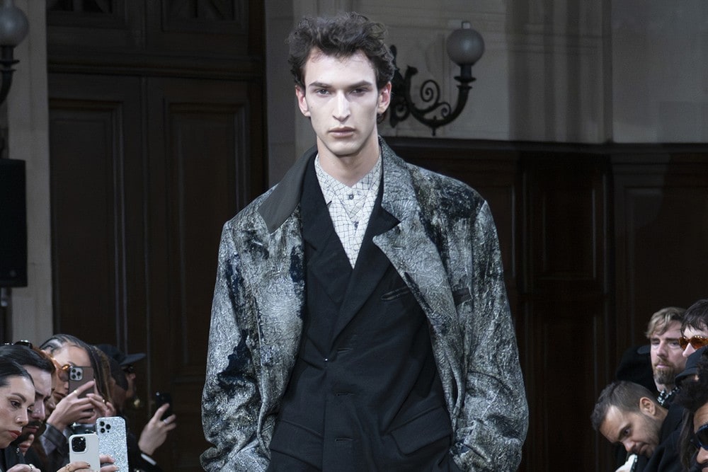
A designer interview series focused on the thinking behind the work, and what goes on behind the creation itself. This time: DISSPARATION, the 2026-27AW collection from Shanghai-based ZIGGY CHEN.
DISSPARATION is a coined word, combining Dislocation and Separation. Dislocate, then separate — and what the collection dislocates itself from is ZIGGY CHEN's own previous work. Continuity ought to matter to a brand, so why, this season, put distance between themselves and their own past?
This interview was conducted in writing. We sent 30 questions, and ZIGGY CHEN answered them in English — from how the theme came about through to fabric, print and colour, construction, and the Paris presentation. His answers are reordered here by subject.
DESIGNER PROFILE
ZIGGY CHEN
Born in Wuhan, China, in 1969. He studied fashion design at the China Textile University (now Donghua University) and, after graduating in 1994, began his career teaching there. He founded Shanghai Shiyi Co., Ltd. in 1999, and in 2012 launched his eponymous label, ZIGGY CHEN.
Working from his Shanghai atelier, he builds clothes around the meeting of tradition and the contemporary, with the weight placed on material research, fabric, detail and volume. He showed his first collection for Autumn/Winter 2012, and has spent more than a decade developing patterns and fit, refining how the clothes wear.
CONTENTSContents
CHAPTER 01
“Less a way to explain the collection than a tool for moving development forward” — how the coined word DISSPARATION came about
To start with: what is the theme this season, and why did you choose it?
The thing that mattered most in arriving at this season's theme was making a clear break with the themes of previous seasons. When I am working on a new collection, I want the change of theme itself to carry me toward a different way of thinking. So even before settling on a name for it, I intended to head in a more abstract, conceptual direction.
In truth, the theme was set up less as a way of explaining the collection than as a tool to help our own development process along internally.
We understand DISSPARATION is a coined word. Which words did you combine, and what did you want it to mean?
It combines dislocation and separation.
The idea of dislocation and separation came out of wanting this collection to differ from those of the last few years — starting with how the fabrics are chosen and made, and extending to how we approach design, construction and craftsmanship.
Continuity is normally very important to a brand. This season, though, I wondered whether we could produce a kind of dislocation and separation from our previous collections. That is the original reason for choosing those two words.
Where did the idea come from?
The original intention was simple: to make the difference from all our previous collections clearer, and to try a few new things. That is why the concept ended up relatively abstract.
The idea itself had been in my head for a while. I simply judged that this was the right season for it.
Of course, beneath this abstract theme there is a more concrete mood board [ed. note: a board assembled from reference photographs and materials]. It holds several elements: the 1980s, practicality and function, weight and masculinity, abstract texture.
At what stage of the process does the theme get settled? Is it there from the start, or does it take shape as you go?
Before I start planning a collection there is usually already a vague idea in my head. As development advances step by step, it gradually comes into focus.
The whole picture normally becomes clear once all the fabrics have been decided. There are still revisions and adjustments once we move into sketching, patterns and garment development, but the initial direction essentially does not change.
CHAPTER 02
“For me, the absence of change is itself boring” — the old-and-new axis
The brand has held to an axis of being old and new at once. How does that relate to this season's theme?
Old and new at the same time. That axis does not change, however much the theme shifts from season to season.
In practice, old-and-new is not something I consciously try to express or explain. Fundamentally it comes out of my own sense of beauty.
If a personal aesthetic is the foundation, change can happen in all sorts of ways: adjusting the weave structure of a fabric, trying a new dye method, altering and refining the structure of a pattern, experimenting with sewing technique. You can run experiments at many different stages.
Some people think too much change is not necessarily good for a brand. For me, though, the absence of change is itself boring.
Are there things you actually keep at hand as a source of ideas — photographs, fabrics, books, anything?
Two things have been beside me for a long time. One is the complete set of The Complete Collection of Song Dynasty Paintings. The other is a series of high-resolution photographs I took myself of the Humble Administrator's Garden [ed. note: a garden in Suzhou, China].
We understand you have long been drawn to the culture of the Jiangnan region around Shanghai. Where does that show most directly this season?
If I had to name the most direct expression of it, I would say colour and the handling of fabric. Those two reflect my understanding of beauty most plainly.
I live and work in Shanghai, an intensely modern metropolis. And yet what makes me feel most strongly connected to something inside myself is traditional architecture, gardens, culture and food.
I think these things sit very deep in a person. They are part of your foundation, and more often than not they go on shaping your daily life and your work without your noticing.
This season the historical references range widely, from court dress to workwear. Are the two connected in your own mind?
Yes, of course. I like combining a number of elements that appear, at first glance, to have nothing to do with one another.
You can take it as simply a habit, or a personal interest. I am not especially fond of having one firmly fixed through-line, or a single clear narrative and nothing else.
CHAPTER 03
“If two or three succeed, that is a very good result” — fabrics built for coarseness and warmth
In what order does a theme turn into actual garments?
Usually it starts from a vague idea. From there I move on to colour and the mood board, gradually making something vague visible. At that point the thinking behind the theme starts to clarify.
The next stage is fabric. I usually make a separate colour chart and mood board purely for the fabrics. Working from that, I then build another mood board focused more tightly on the garment design.
Fabric development covers weaving and weave structure, finishing techniques, print, and other treatments.
Once the fabrics and trims are settled, we move to garment design — which of course includes pattern, construction and technical development.
When the newly developed fabrics are finally finished, we can start making samples for the new season. We follow this cycle every season.
Where did this season's fabrics come from, and how do they connect to the theme?
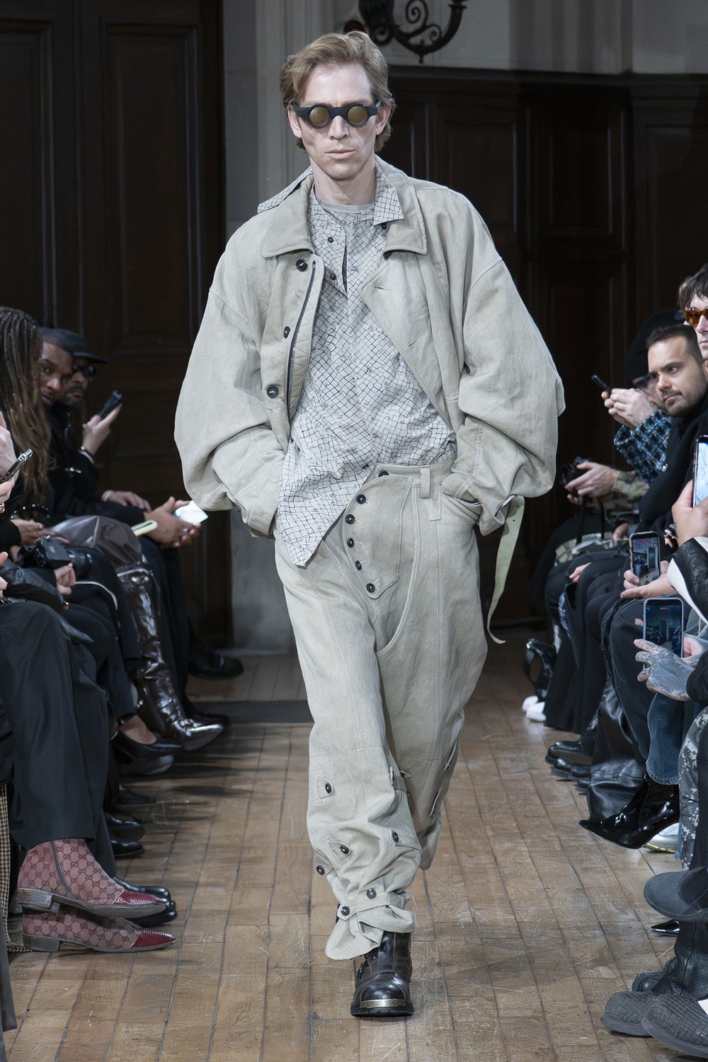
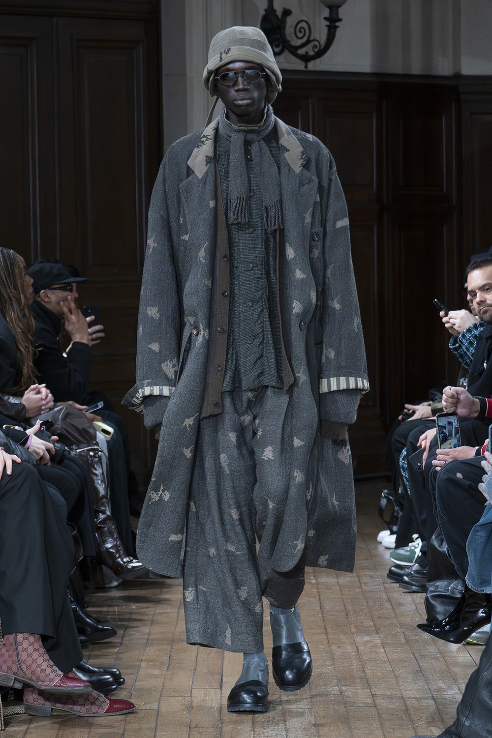
We set two keywords for the fabrics this season: coarseness and warmth.
So in developing the base fabrics, our first considerations were a coarse surface, unevenness, an absence of sheen, and the ability to hold warmth.
At the same time, the fabric had to look as though it already carried traces of use and of time.
That meant every aspect of development — yarn, weave structure, dyeing, finishing — had to be pointed clearly in that direction.
You have previously worked by searching fabric archives from the 1980s and 90s for a pattern, finding a yarn that could reproduce it, weaving that, and then printing over the top. Are there fabrics this season that you built up from the process itself in that way?
Yes. This goes back many years now, but alongside studying the history of clothing, studying textiles was a very important part of my own development.
Personally, I have always preferred fabrics from the 1980s and 1990s, and from earlier periods still.
That said, once I had come to understand those fabrics to some degree, I became less fixated on reproducing or updating vintage cloth. New yarns, and newly developed weave structures, can produce results that are completely different and just as compelling.
These days I work very closely with a textile designer, and the inspiration travels in both directions.
Making something genuinely new is in fact quite difficult. If two or three new fabric developments really succeed in a season, I consider that a very good result in itself.
You leave the slubs and irregularities in the yarn rather than correcting them. How do you communicate that to the mills?
The textile designer is extremely important here, because they bridge me and the mill.
I have worked with many of our suppliers and textile designers for a very long time. Over those years we have built a shared aesthetic and a mutual trust.
Whatever problems come up on the factory floor, we can adjust using a range of technical solutions.
And if you want to keep making new things, you have to accept that some experiments will not work.
CHAPTER 04
“Something like a chaotic universe” — prints and colours drawn from memories of the 1980s
Where did this season's prints come from? Could you be specific about what you actually looked at and referenced?
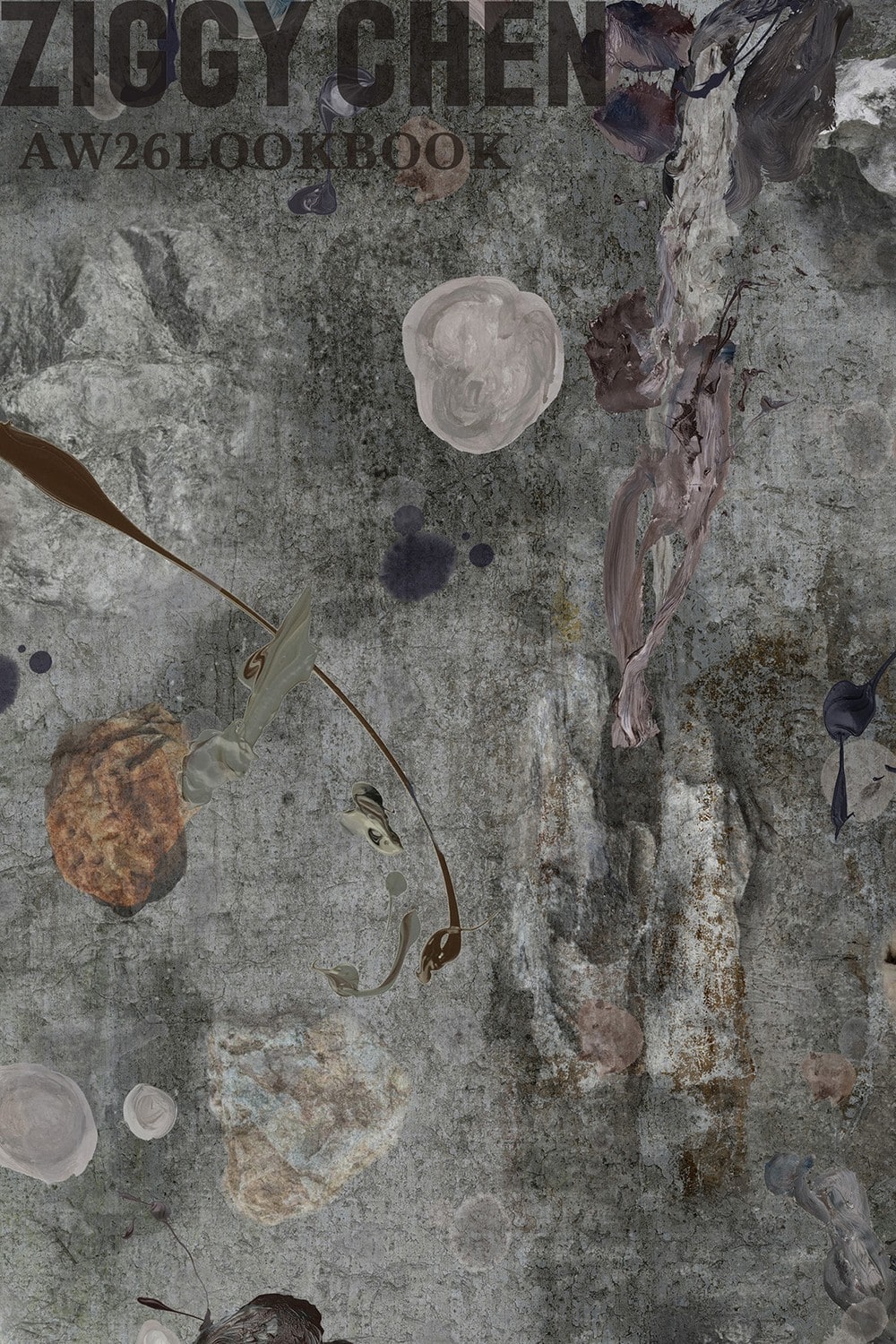
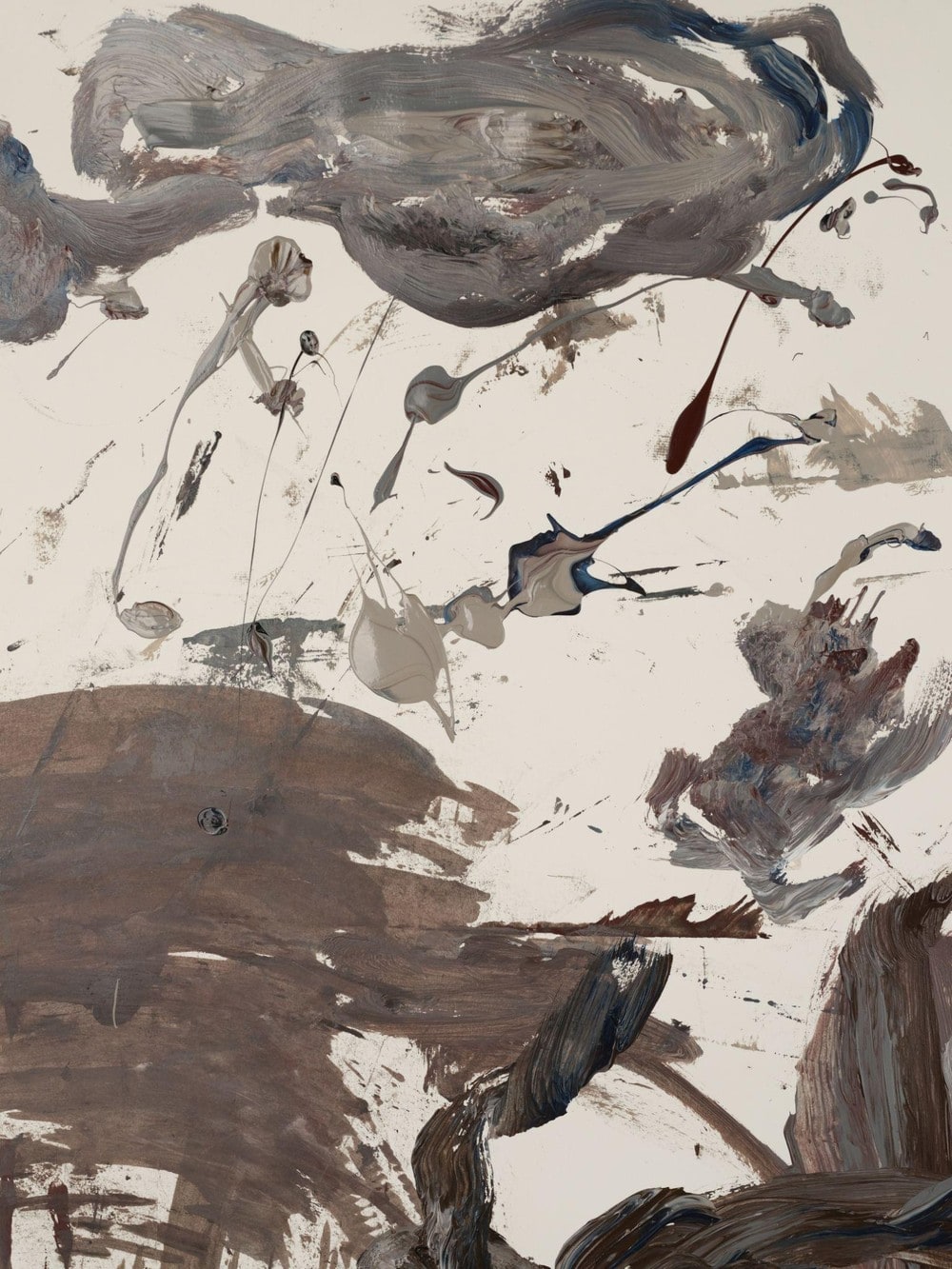
The most important graphic this season is something like a chaotic universe.
Because part of the collection looks back at the 1980s, we used photography and hand-drawn texture to reinterpret our own memory of that decade — its disorder, its vibration, its abstract imagery. We then tied those elements to the 1980s-inspired jackets in the collection.
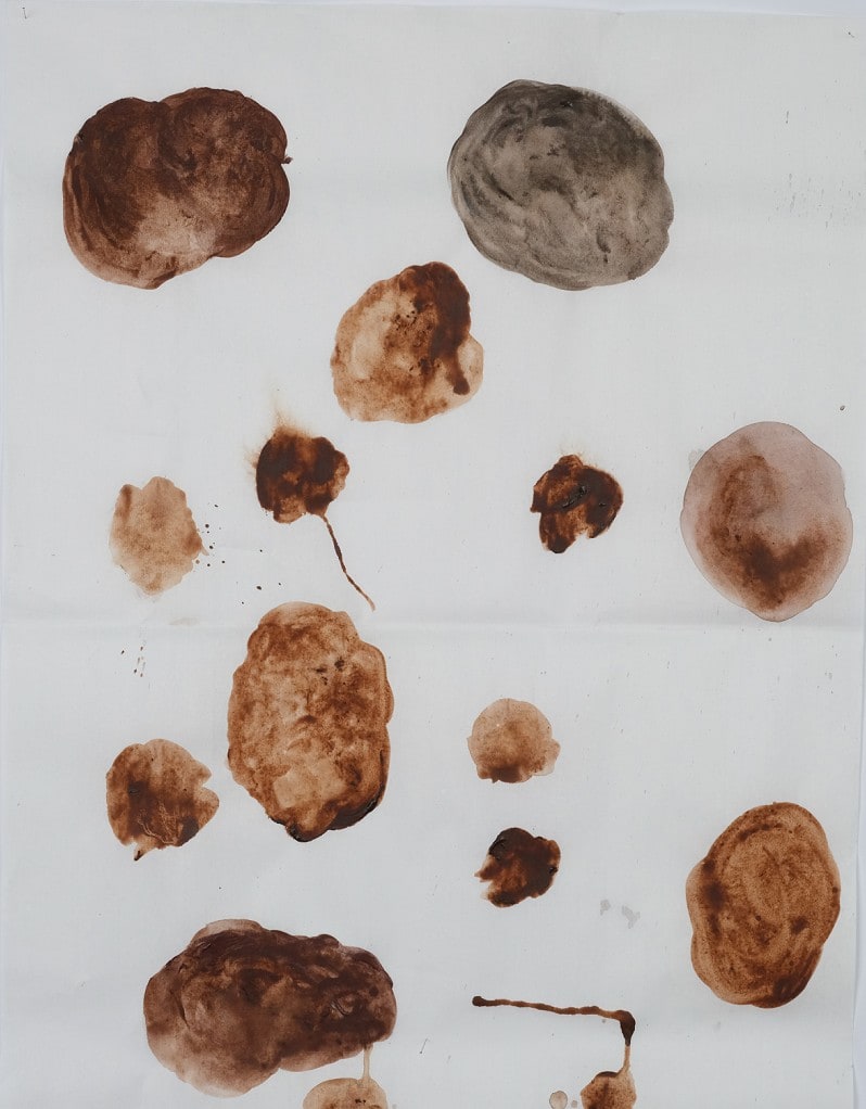
By what process did that idea become a print on cloth?
At first there was only the idea — we had no idea at all what it would finally look like.
For the background we used the walls of a Suzhou garden, marked and altered by time. Within the hand-drawn texture, we imagined cosmic matter and meteorites.
We processed these separate elements digitally to build the main graphic for the new season.
This image, almost an abstract painting, could perhaps itself be called dislocation and separation.
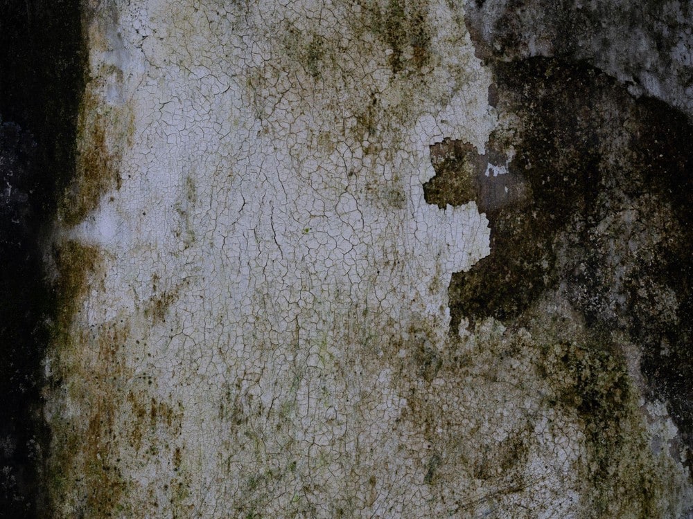
Which part of the theme does that print carry?
The graphic represents the season itself.
At first glance its relationship to the garments themselves may not look especially direct. But for me it represents the chaos of the 1980s as I remember and understand it.
The way various elements mix together within the image is also consistent with how our brand thinks and works.
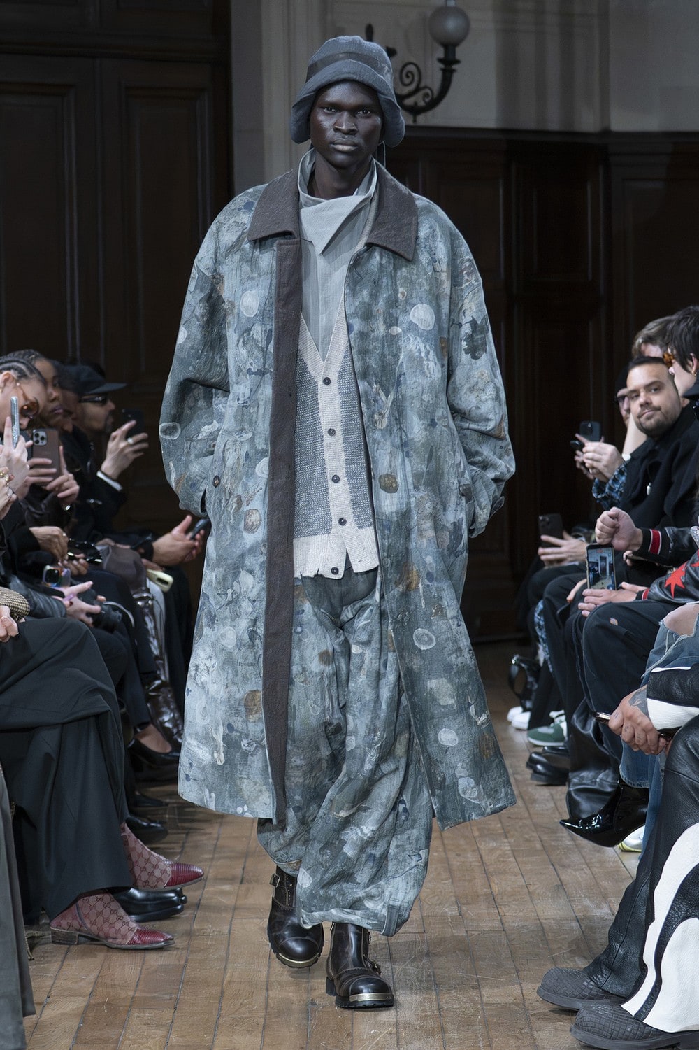
This season's palette is built from warm browns, soft greys, deep grey-blue, black and a muted yellow. What was that combination based on?
Colour choices are normally based on two considerations: colours that answer the market, and colours that answer the theme.
As I said earlier, this season's theme is fairly abstract, so part of the overall palette comes from memories of the 1980s.
Taken as a whole, there is something in these colours that recalls old analogue photographs, or film that has aged.
Ultimately our colour choices are a mixture of the palette the brand has built up over the years and the intuition that develops while preparing each collection.
If you had to name one colour that defines the season, which would it be?
A colour between grey and blue.
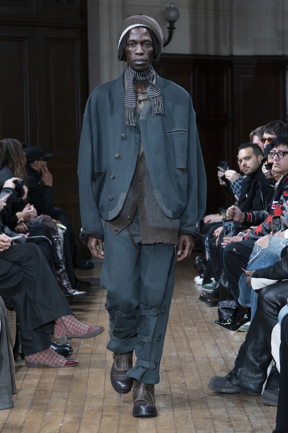
You once described something as being like a figure stepping out of a deep blue storm. When you translate weather or natural phenomena into colour, what do you work from?
The sense of a blue storm came simply from using a dark blue — the blue of rain falling late at night.
The idea of turning raindrops into a print came to me while stuck in traffic on a rainy day.
Although the raindrops themselves could really be any colour.
CHAPTER 05
“The moment I saw it, I badly wanted to try it myself” — construction that began with a 17th-century coat
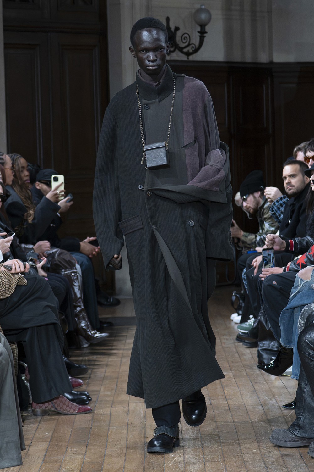
This season there are many designs that bring the lining outward and expose the internal construction. Where did that approach begin?
We first began trying this technique for Spring/Summer 2026. From there we developed and updated it further for this season.
The idea came from seeing the construction of a particular 17th-century coat. The moment I saw it, I felt a very strong urge to try the technique myself.
What I was after was something that feels soft while still holding its structure and tension.
The garments are built so that seam allowances and interlining [ed. note: cloth placed inside the outer fabric to hold its shape] remain visible. Did you change the sewing order or the specifications in order to show them?
Yes. Building this new construction is considerably more complex than making a conventional garment fully lined.
The difficulty lies in holding the right balance between the outer fabric and the layer of dew-retted [ed. note: the process of loosening fibre from the stem so it can be extracted] bast fibre [ed. note: fibre taken from the bark of a plant stem]. It has to be assembled with great precision.
In terms of production time, this method takes at least twice as long to sew as conventional construction.
But it also produces a far more interesting experience, and a far more interesting result.
How do you think about choosing the materials that are hard to see from outside, such as linings and interlinings?
Beyond the fabric itself, I regard every component and trim used in a garment as important.
A garment is not made only of what meets the eye from outside — the outer fabric, the buttons, the zips. The lining, the internal materials and the other components matter just as much, because your attitude to how a garment ought to be made shows up there.
This too comes from our fundamental belief that clothing should serve the person wearing it.
For the materials that touch the body directly we mainly choose silk and cupro, because they feel good against the skin. Around the front of a garment we often use linen or dew-retted bast fibre in place of conventional interlining.
The cupro, cupro-cotton and silk fabrics we often use for linings were also specially developed to our own requirements and understanding.
What I ultimately want to build, beyond comfort, is a relationship in which the garment and its wearer slowly develop something like trust in one another over time.
CHAPTER 06
“You only begin to feel it once it is on” — silhouette, layering and pattern
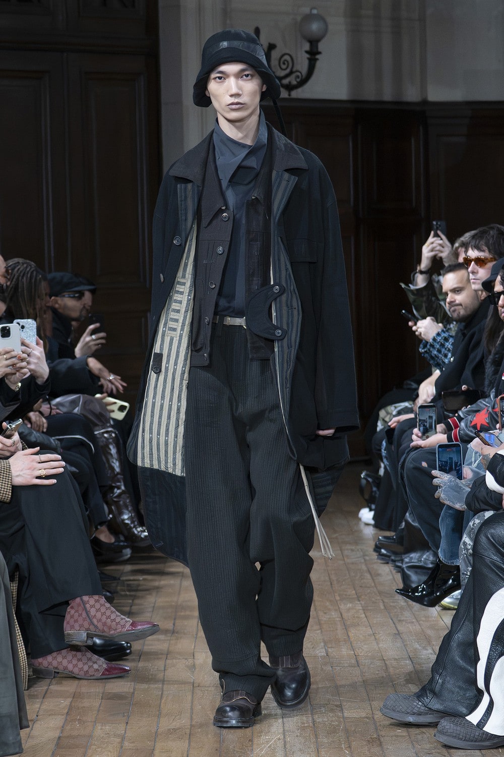
Where did this season's silhouettes and styling come from? Could you also explain how they connect to the theme and to the brand's thinking?
There are broadly two directions to this season's silhouettes.
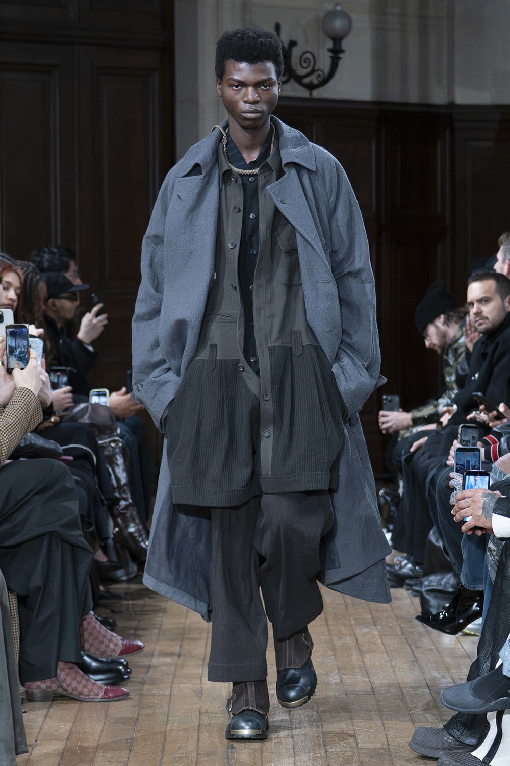
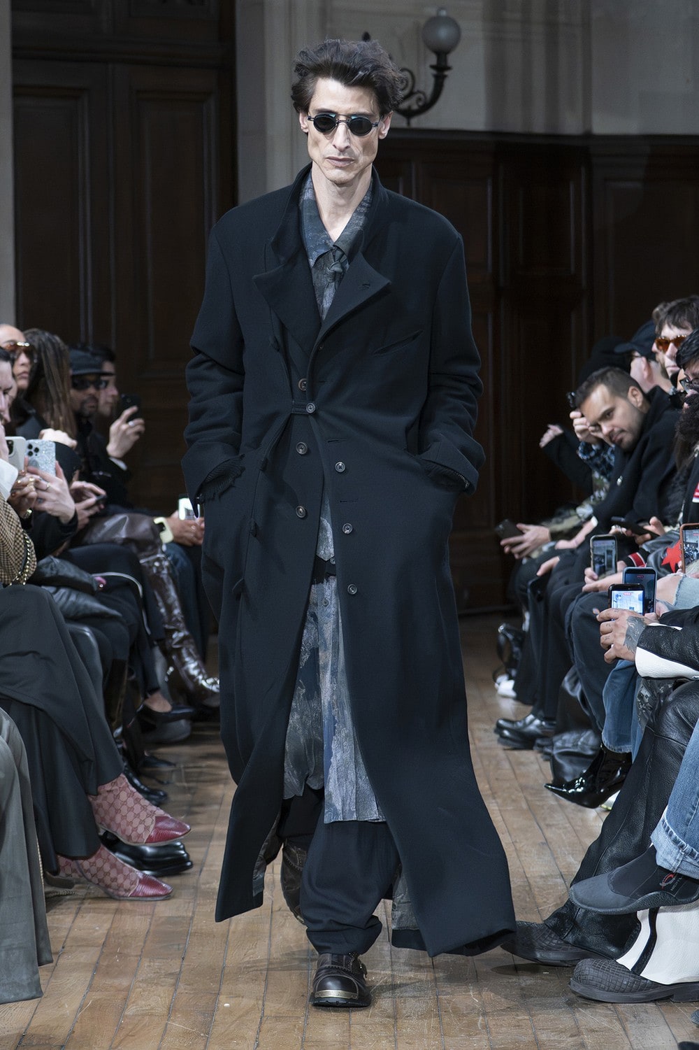
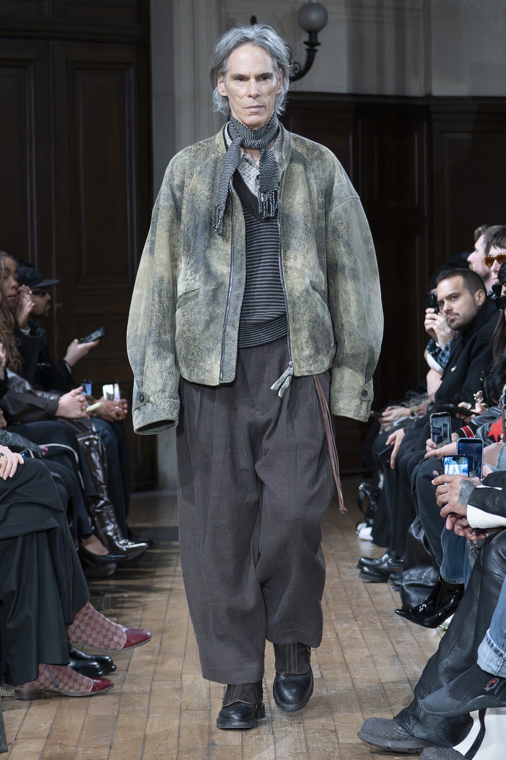
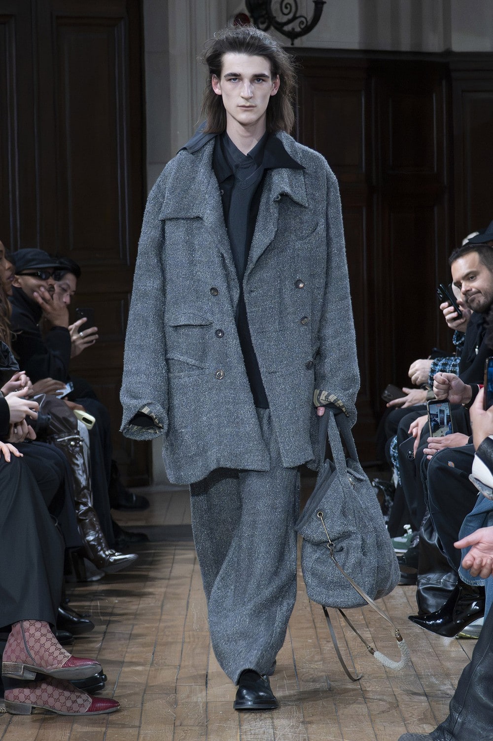
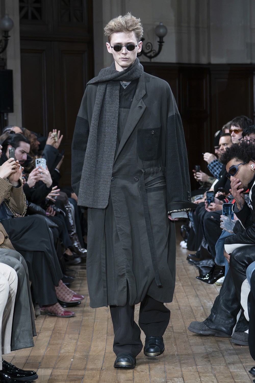
One is a reinterpretation of silhouettes we have built in previous collections. The other is the introduction of distinctly deformed 1980s jacket shapes, and of extremely long coats. The coexistence of these different silhouettes also reflects the idea of combining unlike elements.
That said, if we are going to talk about silhouette, I would also like to talk about construction and detail — because that is where this collection differs from previous seasons.
Specifically, we reduced the amount of design that comes purely out of structural assembly. In its place we directed more attention toward detail and craftsmanship.
A garment does not necessarily need to look dramatic at a glance. Only once it is on do you begin to feel the balance of the construction, the handling of detail and craftsmanship, and how the different materials are distributed across the whole piece. That was the intention.
So the structural design has moved in a more practical direction, and that has also affected the styling of the collection.
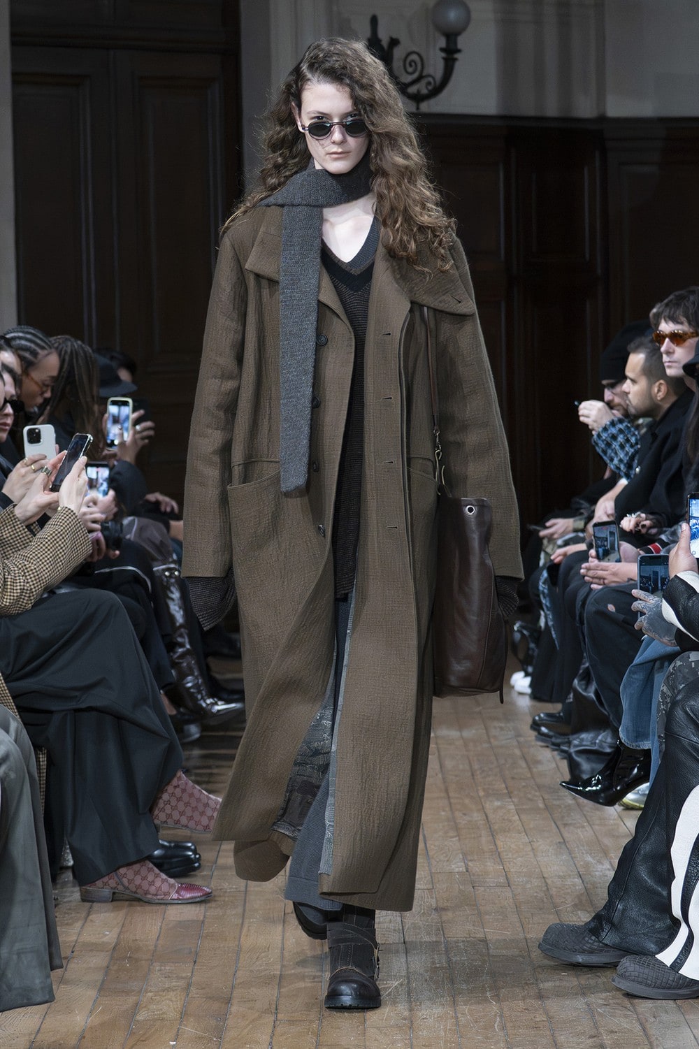
The way the layering is put together also looks different this season.
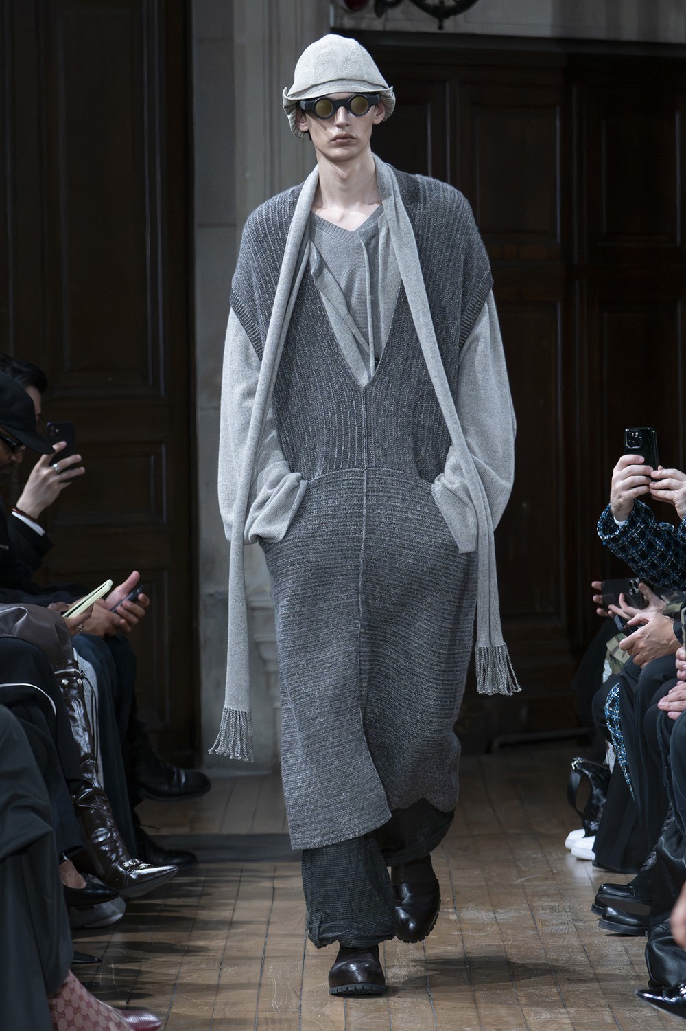
This season I wanted to bring more layers, and more combinations of unlike materials, into each individual look. At the same time, to express the idea of dislocation and separation, we deliberately set conventional thinking about overall proportion slightly aside.
What became especially important this season was a new approach to layering.
I did not want to layer for the sake of layering. It had to feel unforced and convincing — and then, on top of that, the different fabrics and colours had to come together in a way that felt fresh. That was what was needed.
I hoped that would make the collection as a whole look clearly different from what came before.
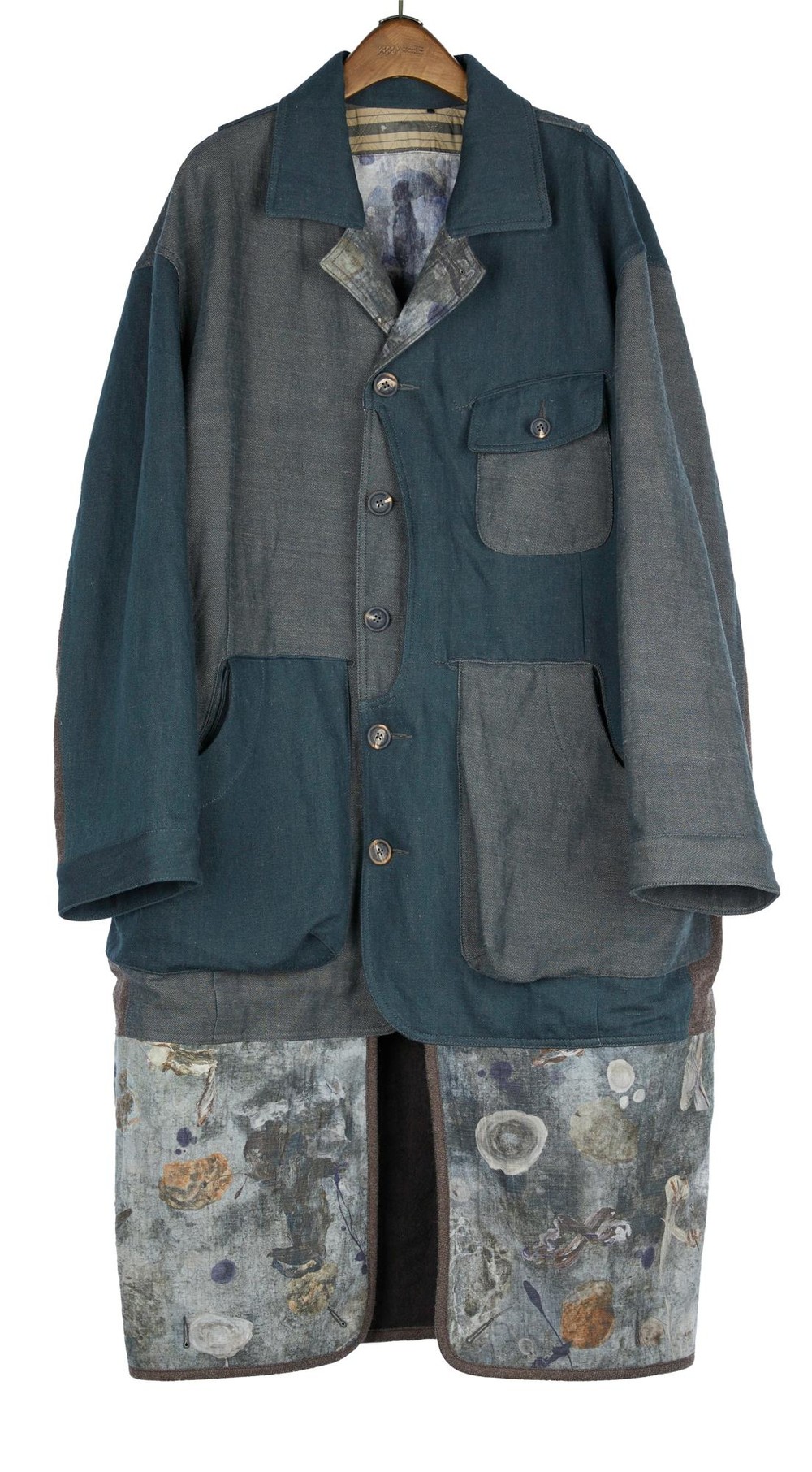
If you had to name the single piece in which the theme shows most strongly, which would it be?
OM2631106 — a coat that combines different fabrics and can be worn a number of ways.
We understand comfort and practicality sit at the centre of your pattern making. How does this season's loose silhouette connect to that?
On pattern and fit, it is true that we place increasing weight on practicality and comfort.
When a compromise becomes necessary, we will often change the design in order to preserve the garment's balance and practicality. To put it another way, we deliberately hold parts of the design back.
The reason is that I want these to be clothes people wear more often in daily life, and for longer.
On that basis, comfort has become one of the most important considerations in pattern making, whether the garment sits relatively close to the body or very loose.
This matters particularly in autumn and winter, when the materials themselves naturally become heavier. At that point a well-balanced pattern is indispensable.
Put simply: a garment may feel heavy in your hands, but once it is on it should not feel as though it is dragging your shoulders down, or as though it is tiring to wear.
What we value most in an oversized silhouette is that it can conceal the body, the distance it creates between garment and body, and the reassurance that comes from wearing something large.
On the other hand, a large garment requires more fabric and more internal material, so it naturally becomes heavier.
Under those conditions, the pattern has to be made more rational and the construction optimised in order to keep the whole garment in balance.
The aim is to distribute the garment's weight more evenly across the whole body — so that even though it is physically heavy, it feels easy once worn.
CHAPTER 07
“At that point, neither the designer nor the brand matters any more” — the Paris presentation, and the person wearing the clothes
This season was shown in a Protestant church in Paris. Why that venue, and how does it connect to the theme?
There were several candidate venues, but the main reason we chose this one was the detail and colour of the church's interior.
As a backdrop, set alongside the colours and materials of the collection, it felt entirely natural.
When I first saw photographs of the church, I knew almost immediately that this was the place.
The final presentation came out very close to what I had first envisaged.
What were you thinking about in the runway styling? Do you think the way the clothes are worn changes how the theme is received?
The styling of a runway show is certainly the most direct way of presenting a collection to an audience.
Change the direction of the styling and how the audience reads and responds to the collection changes with it.
Colour combination is an easy example. Pairing contrasting colours and pairing harmonious tones produce completely different final impressions.
Besides, a collection cannot really be conveyed by a handful of garments. Deciding the direction of the styling is also deciding how the collection as a whole is shown to an audience.
In choosing that direction, there are moments when it is difficult to hold beauty and interest together.
Personally, I will usually take the interesting option over the perfect one.
We have seen it suggested that behind this season lies a figure moving between mountain paths and the city. Is that accurate? If not, could you tell us what figure you actually had in mind?
I do not really think in terms of what kind of person, or what kind of image, someone wearing ZIGGY CHEN ought to become.
Fundamentally, that would conflict with my understanding of the relationship between clothing and people.
Of course, in the brand's official styling we do try to imagine how people with different personalities and characteristics would wear these clothes. But that is ultimately the product of an exchange between designer and stylist, and it exists to communicate the collection to an audience. Honestly, it is one of the parts of my work I enjoy less than the rest.
I have always believed that clothing should serve the person wearing it. People choose different clothes according to their own taste and to how they want to be seen. What they ask of clothing also changes with time and place.
When someone wears or styles ZIGGY CHEN, I want what finally emerges to be that person's own state and character. At that point, neither the designer nor the brand matters any more.
In that sense I think everyone should hold their own ideas and understanding about how to dress and how to construct their own image. I respect each person's individuality.
CLOSING
“I hope to keep hearing more from the Japanese market” — a season that joins what came before to what comes next
Where does this collection sit within the brand's story so far?
This is a very important season for ZIGGY CHEN. I see it as the season that joins what we have done to what we want to do next.
This season we decided to introduce more change.
First, I wanted each individual garment to carry more substance and presence. To that end we have tried a range of fabrics and treatments, broadened the types of garment, raised the precision and balance of the patterns, and refined the craftsmanship and detail.
In every part of the collection, the goal was simply to make it a little better.
The purpose of these changes is to build a stronger foundation for the brand's future development.
Finally, could we ask for a message to your customers in Japan?
I am personally very glad that ZIGGY CHEN has been able to make its way in the Japanese market over so many years. I am sincerely grateful for the support we have received from customers in Japan.
At the same time, I hope we will go on hearing more from the Japanese market.
There are also people I would like to thank here: our Japanese suppliers, who have grown alongside us, and the friends who have worked with me and supported me over many years.
EXPLORE THE COLLECTION